
8 Excellent Approaches to Naming Your Fitness or Wellness Brand
Names are one of a brands’ most valuable assets. Unsure where to even begin on your brand naming process? Get inspired by these 8 approaches to brand naming!
You’ve come up with the perfect name, vision and personality for your up and coming brand, and now it’s time to create a logo to embody it. Your logo is an incredibly important aspect of building your brand because it’s the visual component that the public will come to know, for as long as your brand exists.
There are so many different types of logos that you can have designed for your brand. Regardless of whether you hire your own in-house designer or engage a freelance designer for your logo design process, the following guide put together by our very own designer, will give you 7 types of logos you can consider for your fitness or wellness brand!
1.Pictorial Marks
.jpg?width=500&name=gymshark_social_banner_1200x1200%20(1).jpg)
Pictorial marks as logos use icons or graphic-based designs to represent the brand. They often borrow pre-existing symbolisms of a particular icon to embody to express the brand’s personality - for example, brands who want to appear powerful and aggressive, such as GymShark, use predatory animals to depict their logos. That said, no matter what image you use, you still have the ability to influence what it communicates by the style used.
2. Abstract or Symbolic MarksInstead of using recognisable images - like a shark or apple - these types of logos use geometric or totally abstract designs or symbols to represent a brand. The beauty of abstract or symbolic mark logos is that there is no limit to abstract shapes - only by the imagination of your designer.
Abstract or symbolic marks have a huge potential, when in the right hands, to become an iconic logo in the minds of the public (take for example Pepsi or Adidas), however, knowing what shapes, colours and how to put an abstract logo together requires an experienced designer!
3. Badge Marks & Emblems![]()
Emblem logos consist of font inside a symbol or an icon. While emblem logos often appear traditional and classic, brands such as Starbucks with its iconic mermaid emblem, or Harley-Davidson’s famous crest have proven that emblems can be effectively modernised to suit 21st century brands too.
While badge marks and emblems are great for brands who wish to add more details into their logo, such as the date of establishment or a slogan, you also want to be wary about the difficulties you may face having to recreate this logo on low-resolution mediums and small spaces such as name card. When made small, details on this kind of logo can become difficult to see or read.
4. Mascots
Mascots are generally illustrated characters that represent a brand or organisation and are usually based on people, animals and objects. Mascot logos can strengthen your brand’s identity, build brand recognition and can even breathe life into your brand.
Depending on the type of mascot you use, mascots can be representative of a number of personalities or characteristics about your brand including powerful, cute, wise, cool, quirky, and more. Whatever mascot you choose for your brand, ensure that there’s some form of connection between your chosen mascot and your product or service, or that it relates to your company name.
5. Letterforms
![]()
Lettermark logos are typography-based logos comprised of a few letters, oftentimes representative of a company’s initials. Because lettermark logos place a huge focus on the letters, its success is highly dependent on typography.
There’s so much you can consider to ensure the font you choose communicates exactly what you want. For example, rounded fonts often demonstrate inclusiveness and a welcoming nature. Serif fonts are timeless, formal and traditional, while heavier type fonts on the other hand, can signify dominance, reputability and boldness. If you can’t find what you want in an existing typeface, you can also consider commissioning a designer to create an entirely new one for you.
6. Wordmarks
Wordmarks use the entire brand name as the logo. They work very well particularly if your company has a succinct and distinct name such as “FEDEX". Catchy and memorable names, when combined with strong typography can create a logo with the ability to develop strong brand recognition.
Best practices for word marks are similar to those mentioned above for letterform fonts. Since the focus is on your brand name in the logo, you want to make sure you pick a font that truly encapsulates the essence of your brand.
7. Dynamic Logo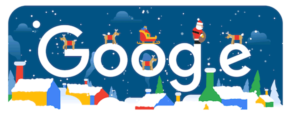
Dynamic logos have the ability to change its shape, colour and wording to suit a different platform or context. While the overall appearance of the logos will change in different adaptations, dynamic logos will always have one constant in the midst of play.
Dynamic logos signify versatility and allows your business to create a series of cultivated impressions on your target audience. The Google logo is a compelling example of a dynamic logo. We’ve all seen its logo changing in certain contexts such as when it’s adapted during festive occasions such as Christmas!
Core Collective is building centres of excellence where the top fitness and wellness professionals collaborate to deliver best services and results for our customers, all under one roof.
Looking to start or grow your fitness, wellness or lifestyle business with minimum risk and value-added support services? Find out more about becoming a partner  .
.